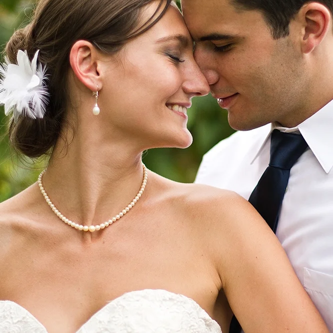
UW Health’s American Family Children’s Hospital has been ranked as a top children’s hospital by U.S. News and World Report, placing it among the elite children’s hospitals in the nation. It is known for providing state-of-the-art healthcare, and a warm, soothing atmosphere that enhances a child's ability to heal.
The goal for this project was to develop a campaign that creates an emotional connection with potential patients and their families, and tells the story of their child’s recovery and returning their focus to enjoying their childhood and hobbies. The strategy was to convince parents and families of children fighting cancer that The UW Health American Family Children’s Hospital provides world-class cancer care, so that they and their child can focus more on enjoying childhood, and less on their recovery. UW Health American Family Children’s Hospital is established as the true option for cancer care, because they understand that parents want to enjoy their kids’ lives, and see them happily thrive in their hobbies and interests, without cancer influencing what they can participate in. The resulting campaign is a celebration of all of the things a parent can look forward to in their child’s future, since they chose the best care for their family.
For this project, I was responsible for the art direction, copywriting, and design.
These layout concepts are from a design challenge given to me by Lands’ End, the American lifestyle brand. The challenge was to design three different layout solutions for women’s fine gauge sweaters. Layouts were required to represent a classic Lands’ End catalog spread, incorporate particular design elements, and utilize type in a way that is design-pleasing and easy to shop. Resource files for images and copy were provided to me by the creative department.
My goal was to keep the layouts clean and fresh, while still maintaining the classic feeling that is a foundation of the Lands’ End brand. The persona I was designing for was a woman with a classic, tailored, polished style, yet still values a sense of comfort.
OFF!® has positioned itself as a leader in insect repellent. The brand is synonymous with unparalleled protection and the freedom to enjoy the outdoors.
The goal for this project was to develop an advertisement that connects with consumers under the notion that “when we’re outside, we’re happier, healthier, and more relaxed.” The strategy was to convince people who enjoy picnics and grilling outdoors that OFF!® towelettes allow them to focus on enjoying their favorite outdoor activities by providing up to eight hours of protection from mosquitoes. The ad establishes an emotional connection and is aimed at positioning OFF!® Towelettes as the way to protect their time outside, because the brand understands that people don’t want their time with family and friends influenced by mosquitoes or the need to reapply repellent. To communicate the message, the copy voice is direct, strong, and frank. It’s informative and assertive, yet slightly tongue-in-cheek.
For the resulting ad, I was responsible for the art direction, copywriting, and design.
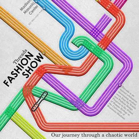
The Threads Fashion Show is an annual showcase of work created by students in the Textiles and Fashion Design Program at the University of Wisconsin-Madison. It is produced through the interdisciplinary collaboration of students across the UW campus, and represents both the intersection of cross-categorical studies and the culmination of three semesters of work. The 2018 theme was Tangled; Our journey through a chaotic world. The event inspired me to create a poster concept.
The objective was to promote the upcoming event with an eye-catching and informative design. I wanted the theme of the piece to embody the slogan “Tangled: our journey through a chaotic world” in an unexpected way. While using the fabric texture and embroidery to maintain an aesthetic tied to fashion and textiles, I created a design that is relatable, and incorporates the sense of a journey by alluding to a subway map. Just as Threads uses lights, music, fashion, and performance to delight its viewers, this poster seeks to engage the Madison community in the appreciation and excitement of modern design.
Description coming soon! In the meantime, feel free to check out my design process for this project by clicking here!
This poster concept was created as a professional development class assignment. The project goal was to advertise an event with a modern, dynamic concept. In addition to designing based on the proportions of the Golden Mean, I was required to utilize the copy, design elements, and images provided by the client.
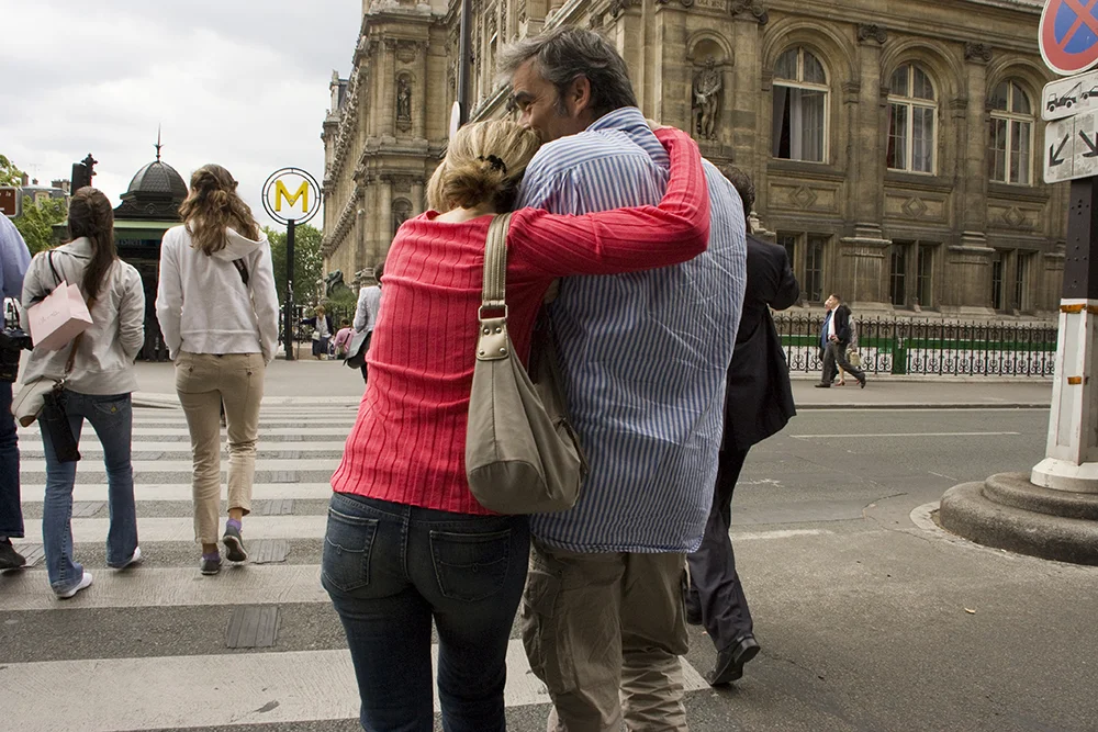
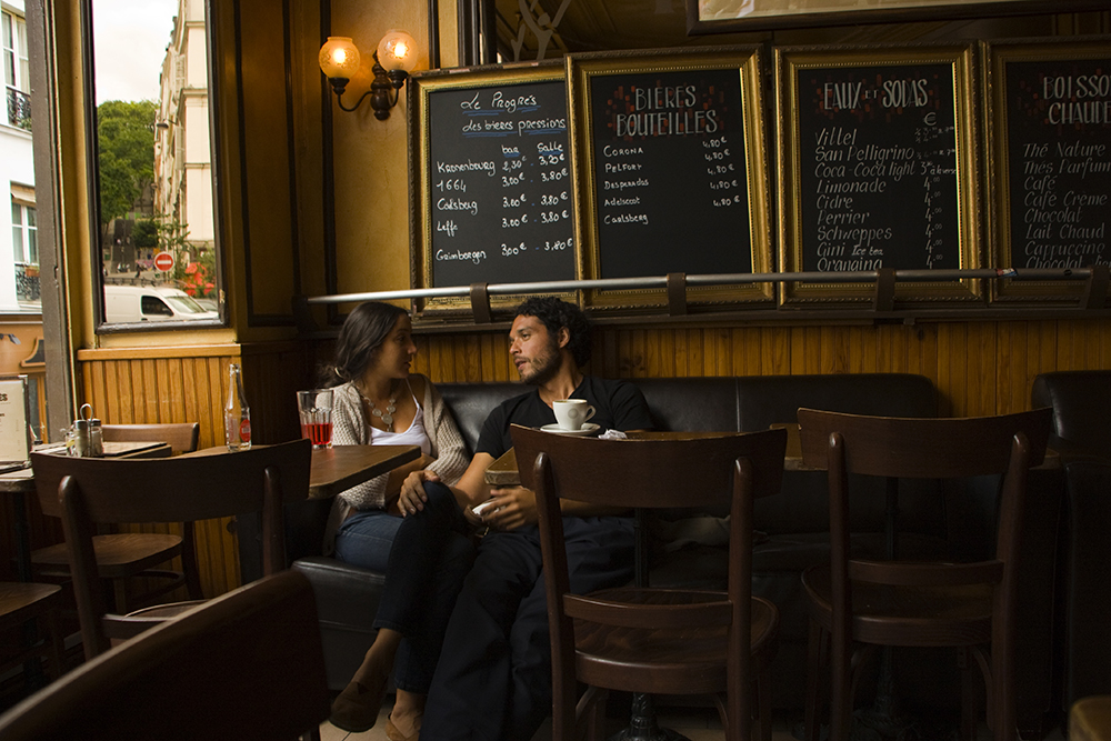
This photo essay, titled French Kiss: A Study of French Affection, is the culmination of my experience studying photojournalism in France. I captured each image, then assembled this collection in collaboration with my mentor, photojournalist Peter Turnley. The collection was exhibited in Paris in 2009.
Teachers don’t have time to search through multiple pages to determine the protocol and appropriate referral coding for particular student behaviors. So, when I was asked to re-design Mount Horeb Middle School’s Behavior Management Flow Chart, I knew that my design solution needed to be organized in a way that considered the time constraints that influence a teacher’s day. My challenge was to take a dense, difficult to read trail of documents, and turn it into an effortless, accessible manual, that clearly establishes an order to managing and documenting particular student behaviors. Working on the team of educators that oversees the implementation of behavioral policies within the school, I was also privy to the integral role that consistency played in a system that was built around accurate record keeping and behavioral data tracking.
The pamphlet I created can be easily used by staff members in multiple roles with teacher and administrative staff material placed on opposite sides. Furthermore, the categorization and strategic arrangement of the content within a tri-fold layout allows teachers to always have the vital details, such as the appropriate referral coding and sequences, on hand. By simply folding it inside out and posting it near their desks, the most frequently needed information is condensed to only one-third of a page. My design solution has proven to refine school data by creating uniformity in how student behaviors are handled, monitored, and documented.
I was hired by both the Mount Horeb High School Volleyball Team and New Berlin Eisenhower Baseball Team to create promotional posters for their respective upcoming seasons. I collaborated with the captains and coaches on each team to conceptualize, plan, and execute their chosen themes. For each of the posters, the team captains chose a theme, and I was responsible for bringing their visions to life through the photography, image editing, and graphic design work.